When you have a small space to decorate,you need to be very selective regarding certain things.In my opinion you should emphasize on minimalism over maximalism .
You need to understand the importance of space and make a creative use of it.Here I have listed some mistakes that you should not commit while decorating a small space and some ways to make efficient use of space.
Mistake 1: Fighting the space
It will be more convenient for you as soon as you accept that your space is small.
If your room doesn't have a space for side table,skipping one of the two will only make your space feel more imbalanced and visually asymmetric.
In order to deal with this try a stool that can be used to rest magazines,remote control and lamps.
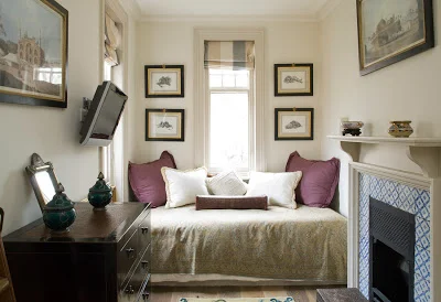
A flat screen instead of media cabinet should be preferred.Skip a full size desk and consider a vanity or narrow console.
Mistake #2 Understanding natural light
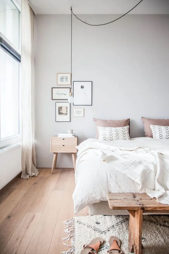
The best way to visually expand a space is to provide maximum natural lightning into it. Use the concept of 'light and shadow' to play with your space.
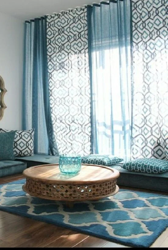
An intelligent use of mirror can be one of the option,Use sheer curtains to filter light instead of blocking it.
The wall paints,hues and color of furniture should be light and posses reflection in such a way that it brightens the overall mood.
Mistake #3 Wasting valuable spaces
Start experimenting with your space and be creative with the efficient use of it.
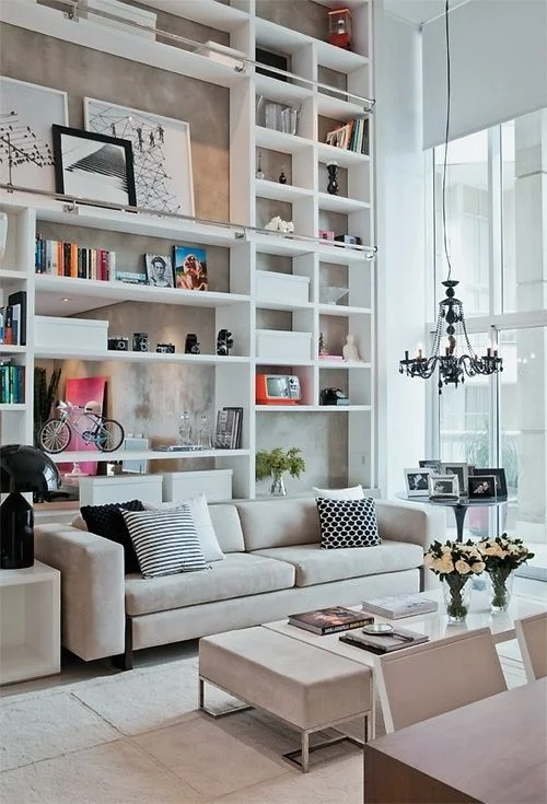
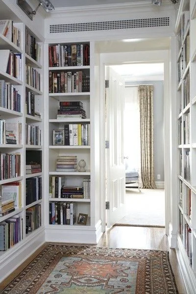
Use the space above the window frame,incorporate floor to ceilingshelves,A built in seating can be one of the best option for small spaces.
Placing sofa in front of book shelves enables unexpected,hidden storage on the shelves behind it.
For a small kitchen use the space under the overhead cabinet for hanging utensils instead of placing them on counter.This provides an opportunity to hide the lessattractive vessel in the lower cabinets and drawers.
If you have a tiny bathroom try forgo art above toilet in favor of hanging cabinet to increase your closed space.
Mistake #4 Interrupting visual flow
If you have smaller rooms adjacent to one another,connect them with unified color palette, similar materials and a identical style.
This will help the entire space seamlessly flow together.The rooms will act as an extension to one another that will provide a length to your space
Mistake #5 Crowding the surfaces
It's important to evaluate your belongings and make efficient use of your space.
No matter how creatively you use your space the extra storage will always be limited.So keep the belongings that are meaningful and functional. extra bulk will meaninglessly waste your valuable space.
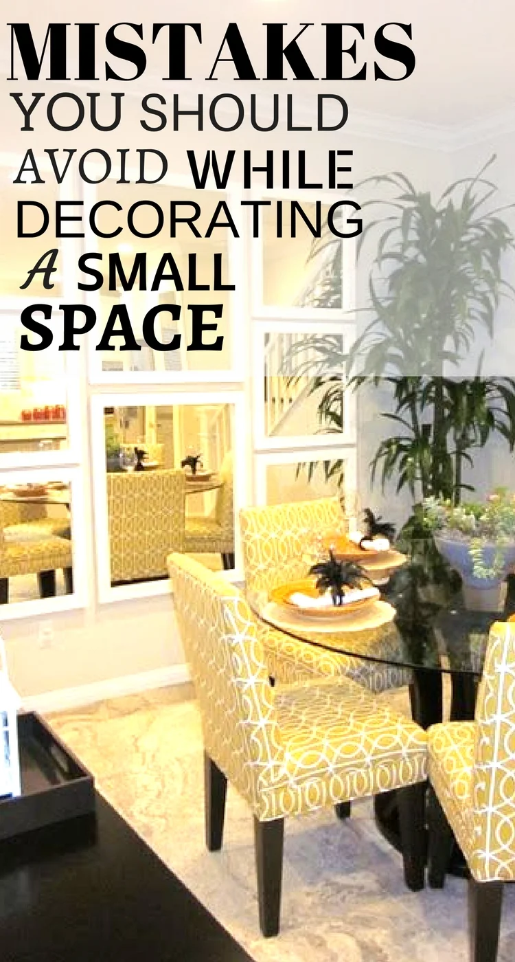
Mirrors visually double the space by creating a reflection so it is good to havemirror in places that are and are used most of the time of the day.
Mirrors can be best used almost everywhere including dining,kitchen,bedroom and bathroom.
Mistake #6 Playing it safe
Amplify your space as per your preference, if you prefer minimalism than avoid the clutter and decorate your home with simpler patterns.
But, if you prefer maximalism then don't add bulky furniture,try incorporating large sized patterns and bright colored accents to add depth to your space.
Bold color wallpaper as per the mood of the space or a bright drapery hung close to the ceiling will distract viewer from lack of space and create a focal point.

